Worth designing for.
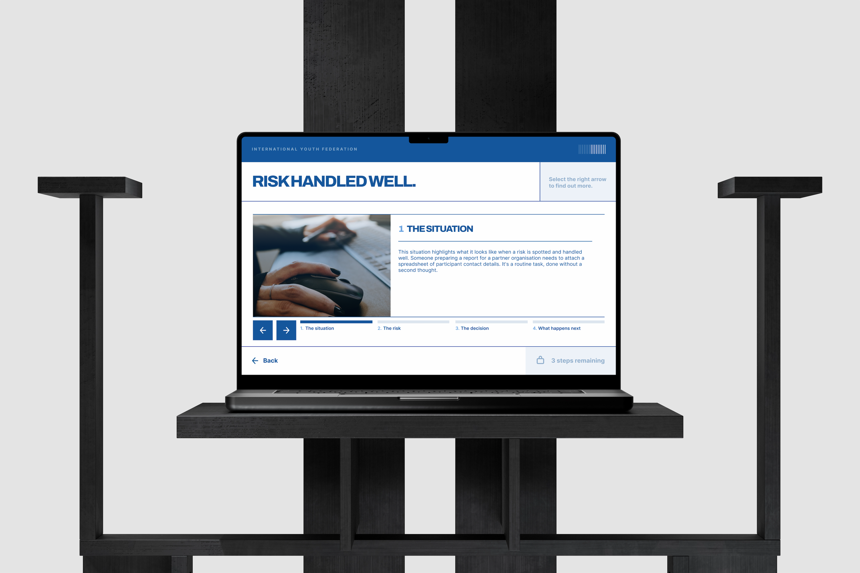
Volunteer work gets treated like an afterthought more often than it should. I wanted this to feel professional, as if their time was worth designing for, whether they are paid or unpaid. The palette is distinctly IYF, the design style more modern and eye-catching, with interactions you would expect from a commercial product.
Nothing to memorise, everything to recognise.
Risk doesn’t sit with one specialist team. The product and the learning objective aims to be simple: notice when something’s off, and raise your concern to the right people. Each area, safety, safeguarding, data, finance, delivery, reputation is creatively referenced. Deeper training on those topics sits in other courses, which I have also designed, and this one points volunteers there rather than trying to cover everything.
What good actually looks like.
A routine email goes to the wrong people. Someone raises it while there’s still time to fix it. The right behaviour is shown and praised, as a model rather than a warning, so good judgement looks like something any volunteer in that job could manage. Then, in a safe space, short scenario questions test instinct rather than recall. Detailed feedback supports a wrong answer, while succinct feedback supports a correct one.
Built once, used everywhere.
The screen types and interactions were all built to be reused rather than reinvented for each topic. Previous IYF learning materials had been inconsistent, and the quality varied. I wanted to create a shared template to speed up module development and keep standards consistent. The feedback on that approach has been positive.
Worth designing for.
Volunteer work gets treated like an afterthought more often than it should. I wanted this to feel professional, as if their time was worth designing for, whether they are paid or unpaid. The palette is distinctly IYF, the design style more modern and eye-catching, with interactions you would expect from a commercial product.

Nothing to memorise, everything to recognise.
Risk doesn’t sit with one specialist team. The product and the learning objective aims to be simple: notice when something’s off, and raise your concern to the right people. Each area, safety, safeguarding, data, finance, delivery, reputation is creatively referenced. Deeper training on those topics sits in other courses, which I have also designed, and this one points volunteers there rather than trying to cover everything.

What good actually looks like.
A routine email goes to the wrong people. Someone raises it while there’s still time to fix it. The right behaviour is shown and praised, as a model rather than a warning, so good judgement looks like something any volunteer in that job could manage. Then, in a safe space, short scenario questions test instinct rather than recall. Detailed feedback supports a wrong answer, while succinct feedback supports a correct one.

Built once, used everywhere.
The screen types and interactions were all built to be reused rather than reinvented for each topic. Previous IYF learning materials had been inconsistent, and the quality varied. I wanted to create a shared template to speed up module development and keep standards consistent. The feedback on that approach has been positive.