Where the gaps actually are.
L&D teams and admins should be able to see where people are actually going wrong, not only who has completed a module. The dashboard opens on live activity, topic mastery, and upcoming regulatory events, with deep reporting and admin controls, so the next piece of learning comes from evidence, not a catalogue.
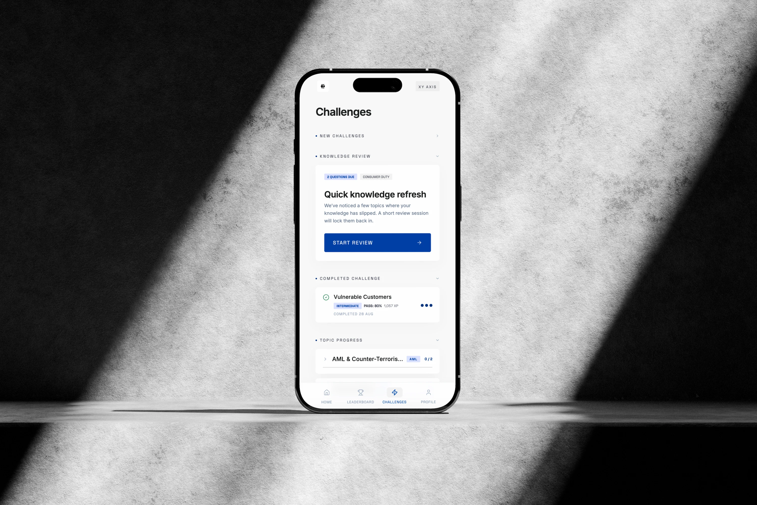
An app worth opening.
New challenges, the leaderboard, and a clear view of how they are doing, all in one learner app. Score and position sit front and centre, so the gamified side of the product is obvious from the first screen. Built for a phone, and kept clean so it feels like something they already know how to use.
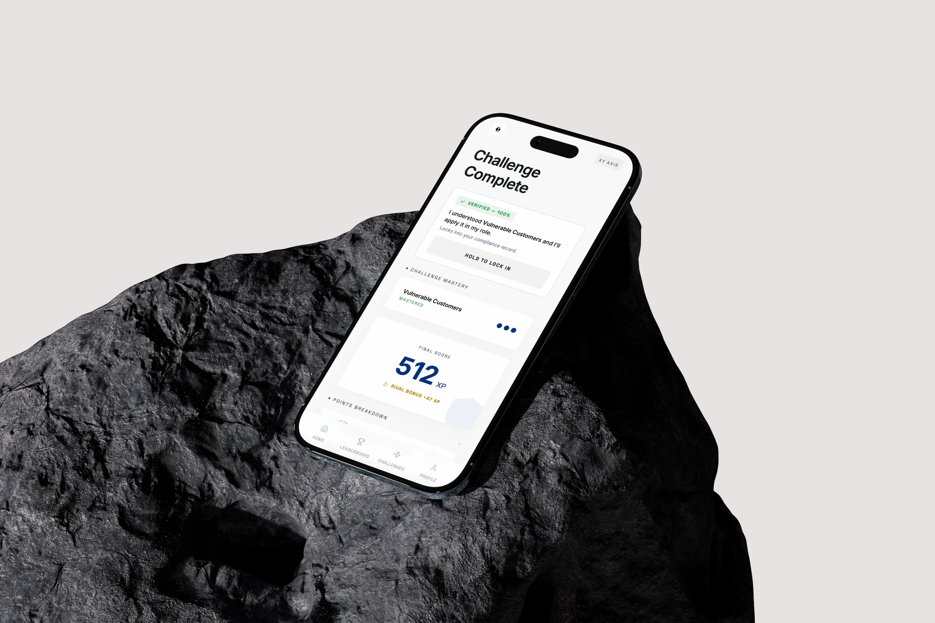
Reinforce before it fades.
The app uses what each person has already done to decide what to ask next, and when. Questions and timing are suggested from their data, so knowledge is reinforced before it fades, rather than waiting for the next scheduled course.
More than multiple choice.
Multiple choice is one of a few challenge types, not the only one. This screen keeps a timer and a score in view, shows feedback as you go, and lets support be switched on or off. The interface stays out of the way, so the question is what you notice.
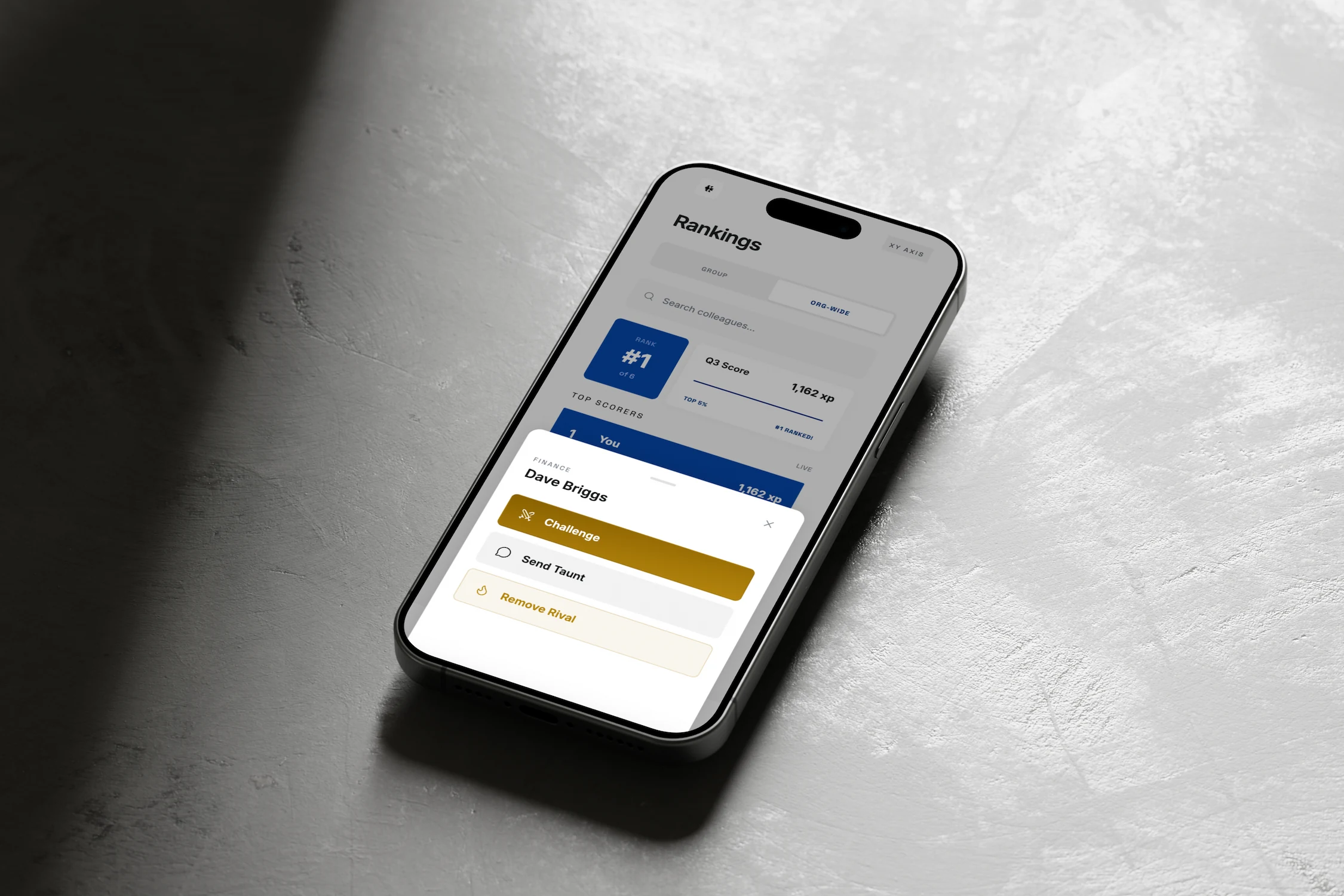
A reason to come back.
Rankings by group or across the organisation, and a rival you can challenge. You can send a friendly taunt or a bit of encouragement, and admins can turn that off in settings if it is not right for the organisation. It is there so people open the app again, not only when they are told to.
Where the gaps actually are.
L&D teams and admins should be able to see where people are actually going wrong, not only who has completed a module. The dashboard opens on live activity, topic mastery, and upcoming regulatory events, with deep reporting and admin controls, so the next piece of learning comes from evidence, not a catalogue.

An app worth opening.
New challenges, the leaderboard, and a clear view of how they are doing, all in one learner app. Score and position sit front and centre, so the gamified side of the product is obvious from the first screen. Built for a phone, and kept clean so it feels like something they already know how to use.

Reinforce before it fades.
The app uses what each person has already done to decide what to ask next, and when. Questions and timing are suggested from their data, so knowledge is reinforced before it fades, rather than waiting for the next scheduled course.
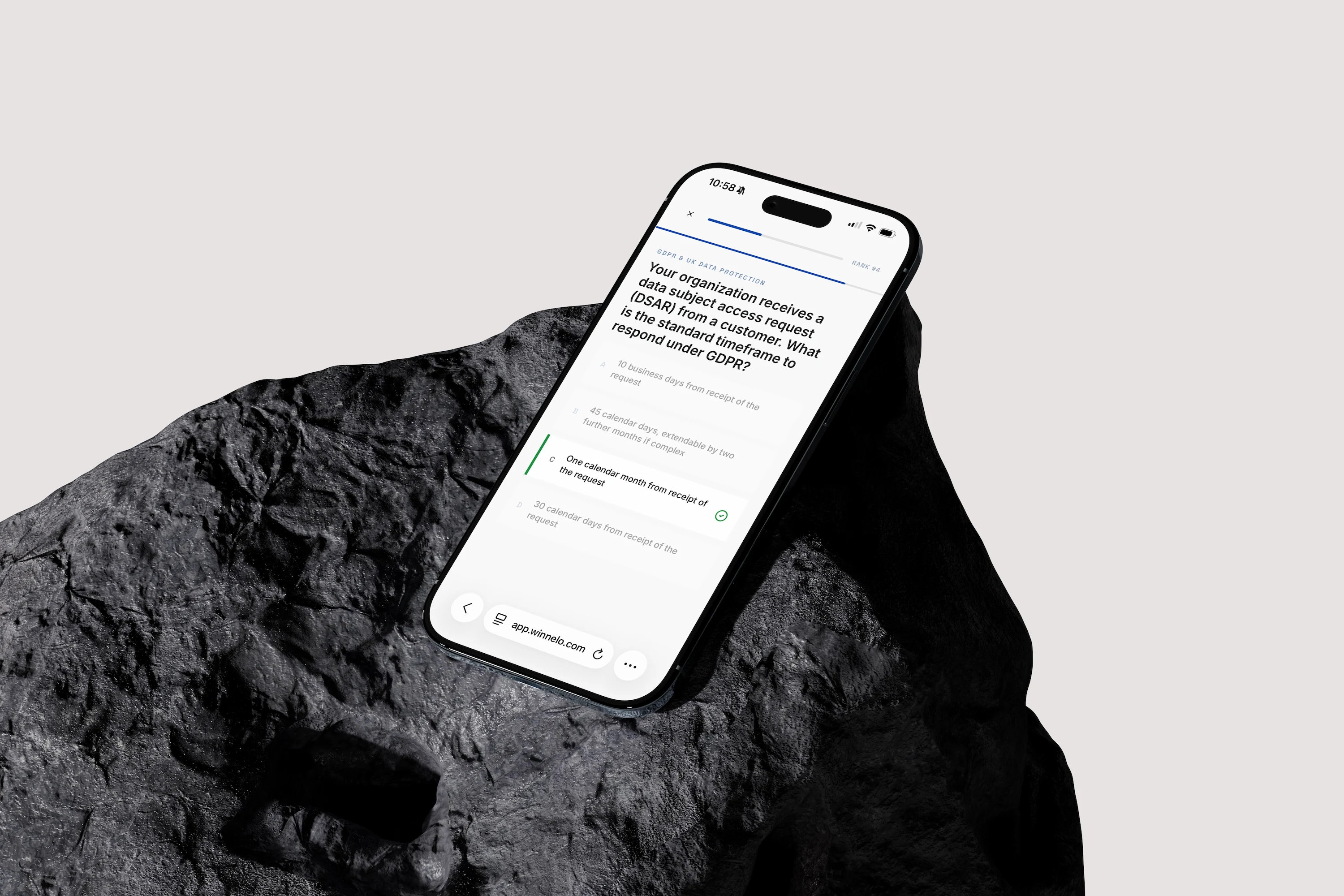
More than multiple choice.
Multiple choice is one of a few challenge types, not the only one. This screen keeps a timer and a score in view, shows feedback as you go, and lets support be switched on or off. The interface stays out of the way, so the question is what you notice.
A reason to come back.
Rankings by group or across the organisation, and a rival you can challenge. You can send a friendly taunt or a bit of encouragement, and admins can turn that off in settings if it is not right for the organisation. It is there so people open the app again, not only when they are told to.